
Certificate Design Free
Great certificate design balances authority, elegance, and clarity. Whether it is for an academic achievement, corporate milestone, or online course completion, a well-crafted certificate transforms a simple piece of paper into a powerful token of recognition that recipients are proud to display.
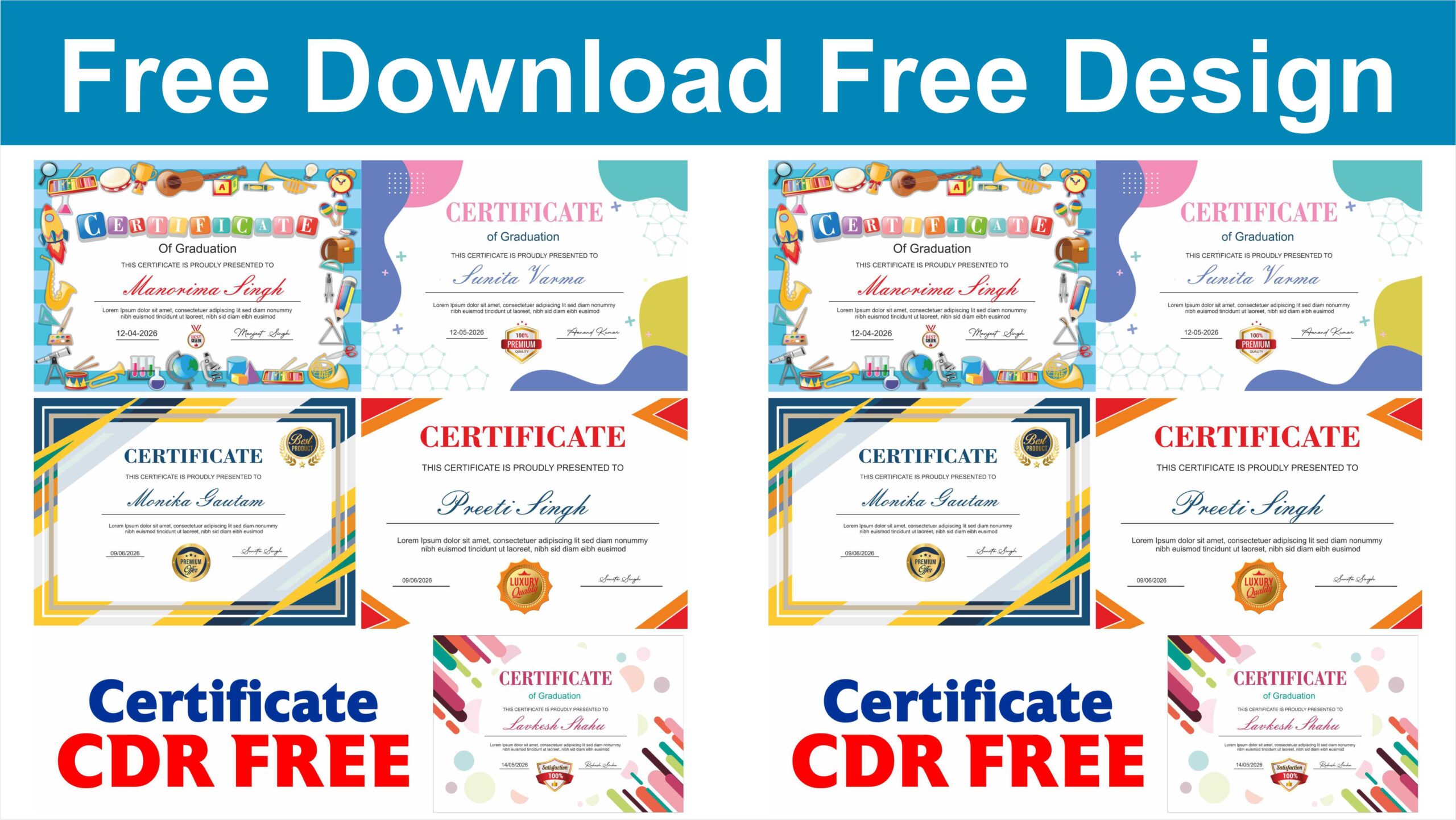
The most effective certificates follow a deliberate visual hierarchy that guides the viewer’s eye. At the top, the issuing organization’s name or logo establishes immediate credibility. Next comes the title of the certificate, which should be bold and prominent. The recipient’s name takes center stage, usually set in a distinctive or slightly larger typeface to emphasize their individual achievement. Below the name, a brief description explains exactly what was accomplished, followed by critical validating details like the date, location, and official signatures.
Typography plays a massive role in setting the tone. Traditionally, formal certificates rely on classic serif fonts or elegant script typography to convey a sense of prestige and history. However, contemporary designs often favor clean, minimalist sans-serif typefaces to achieve a sleek, modern aesthetic. The key is to limit the design to two or three coordinating fonts to prevent the layout from feeling cluttered or chaotic.
Color palettes should be chosen carefully to reflect the identity of the granting institution. While metallic accents like gold, silver, and bronze are timeless choices that universally signify excellence, pairing them with deep corporate tones like navy blue, emerald green, or burgundy adds sophisticated contrast. For modern tech certifications, a minimalist white background with a single vibrant accent color can look incredibly striking.
Incorporating subtle security features and design accents can elevate a certificate from ordinary to exceptional. Intricate guilloche patterns, delicate borders, and textured background tints not only add a layer of professional polish but also give the document an authentic, hard-to-replicate feel. Leaving ample white space around the text blocks is equally important, as it gives the elements room to breathe and keeps the overall aesthetic balanced and clean.
Finally, the digital transformation of professional spaces means certificates must be designed with both print and digital sharing in mind. While high-quality textured paper stock remains the gold standard for physical presentation, the layout must look just as sharp and impressive when shared on professional networking platforms like LinkedIn. By combining clear information layout, purposeful typography, a sophisticated color scheme, and clean design elements, you can create an impactful certificate that honors the recipient’s hard work and beautifully represents your brand.
