
The Art and Purpose of Certificate Design
A certificate is more than just a piece of paper; it is a physical or digital manifestation of achievement, hard work, and credibility. Whether it’s for a corporate training program, an academic milestone, or a volunteer appreciation event, the design of a certificate carries the weight of the accomplishment it represents. Effective certificate design balances prestige, brand identity, and clarity.
1. The Core Elements of Structure
Every professional certificate relies on a standard hierarchy of information to ensure it looks official and remains readable.
The Title: Usually positioned at the top, using terms like “Certificate of Achievement” or “Diploma.” This sets the tone immediately.
The Presentation Line: Phrases like “is hereby awarded to” or “this is to certify that” act as the bridge between the title and the recipient.
The Recipient’s Name: This is the most important variable. The design must allow enough white space for names of varying lengths without looking cramped.
The Description: A brief statement explaining why the certificate is being given (e.g., “For completing the 2026 Advanced AI Ethics Workshop”).
The Date and Location: Essential for record-keeping and authenticity.
Signatures and Seals: These provide the “authority.” A digital or hand-signed signature from a high-ranking official, paired with an embossed or gold-foiled seal, adds an undeniable layer of legitimacy.
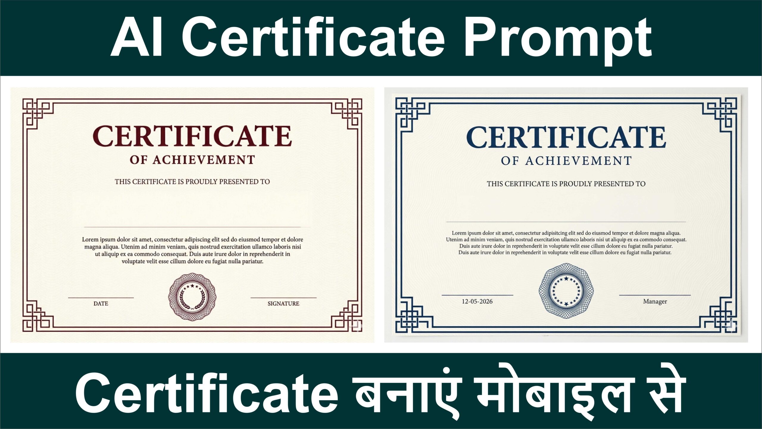
Subject: A highly realistic, professionally printed, classic “Certificate of Achievement” blank template. Landscape orientation, A4 proportions. It must look like a physical, high-quality printed document, not an AI-generated graphic.
Background & Texture: Premium, cream-colored (off-white) paper with a very subtle, fine, continuous wavy-line guilloche watermark texture across the entire background.
Border: A precise, dark Red, geometric Art Deco-style double-line border. The four corners should feature intricate, interlocking, step-like geometric corner designs.
Header Text:
Top center: “CERTIFICATE” in a large, bold, classic, dark Red serif font.
Directly below: “OF ACHIEVEMENT” in a smaller, dark Red, tracked-out font.
Below that: “THIS CERTIFICATE IS PROUDLY PRESENTED TO” in a small, elegant, dark Red font.
Name Area (Crucial): Directly below the presentation line, leave a wide, completely blank and empty space. There must be absolutely no text, no lines, no placeholders, and no black boxes in this area. It should be nothing but the blank off-white textured paper, leaving room for a user to add a name later.
Body Text: Below the blank name area, include a paragraph of placeholder text in a small, clean, dark serif font: “Lorem ipsum dolor sit amet, consectetur adipiscing elit sed do eiusmod tempor et dolore magna aliqua. Utenim ad minim veniam, quis nostrud exercitation ullamco laboris nisi ut aliquip ex ea commodo consequat. Duis aute irure dolor in reprehenderit in voluptate velit esse cillum dolore eu fugiat nulla pariatur.”
Bottom Elements:
Bottom center: An intricate, dark Red circular certificate seal/badge featuring a geometric spirograph/guilloche pattern and a wreath of stars inside.
Left side: A thin, dark Red horizontal line with the word “DATE” centered directly beneath it.
Right side: A thin, dark Red horizontal line with the word “SIGNATURE” centered directly beneath it.
Quality & Style: Photorealistic, perfectly symmetrical, crisp and flawless typography, high resolution (8k). The final image must look like a scanned, perfect, blank paper certificate. in A4 Size Landscape