
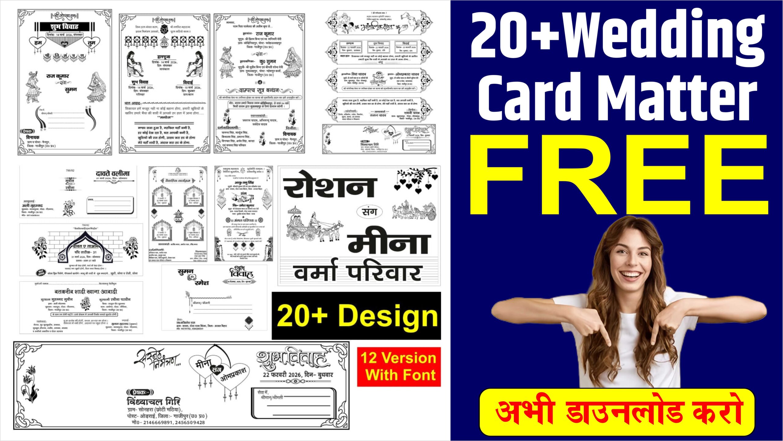
Shadi Card Matter Design Free Download
Designing a wedding card is an intricate blend of storytelling, personal aesthetics, and essential communication. It serves as the first tangible glimpse guests receive of the upcoming union, setting the tone for the entire event—whether it be a formal black-tie affair or a whimsical garden celebration.
To create a compelling design, one must balance three core pillars: Visual Theme, Typography, and Materiality.
1. Defining the Visual Theme
The theme acts as the design’s soul. Modern wedding cards often lean toward one of three directions:
Minimalist: Focused on “white space,” this style uses clean lines and a limited color palette (like sage green and cream or classic monochrome). It relies on the quality of the layout rather than ornate decorations.
Traditional/Floral: Often incorporating botanical illustrations, watercolor wreaths, or intricate ethnic patterns (like mandalas or damask). This style feels timeless and romantic.
Contemporary Bold: Using vibrant colors, geometric shapes, or even custom illustrations of the couple or the venue.
2. Typography and Hierarchy
Typography is perhaps the most critical element of the design. A successful card usually employs a “font pairing” strategy:
The Hero Font: Typically a sophisticated script or calligraphy font for the names of the couple. This should feel elegant but remain legible.
The Supporting Font: A clean Serif or Sans-Serif (like Montserrat or Playfair Display) for the logistical details—date, time, and location.
Hierarchy ensures the guest’s eye moves in the right order. The names should be the focal point, followed by the invitation statement, and finally the event specifics. Avoid cluttering the main card; use insert cards for maps, RSVP details, or QR codes for digital registries.
3. Layout and Software Precision
For professional results, designers often turn to vector-based software like CorelDRAW or Adobe Illustrator. These tools allow for precise control over “bleed” areas and “trim” lines, ensuring that no vital text is cut off during the printing process. When designing in these programs, using layers is essential—keeping the background, decorative elements, and text separate allows for easy adjustments to colors and alignment.
4. Paper Selection and Finishes
The physical feel of the card (the “hand-feel”) is as important as the visual. Common choices include:
Vellum: A translucent paper that adds a layer of mystery and elegance.
Linen or Cotton Cardstock: Provides a rich, textured feel that screams premium quality.
Finishing Touches: Techniques like Foil Stamping (adding metallic gold or silver accents), Embossing (raising the paper for a 3D effect), or Letterpress (indenting the ink into the paper) elevate a standard design into a keepsake.
5. Color Psychology
Colors evoke specific emotions. Gold symbolizes luxury and tradition; navy blue suggests stability and formality; blush pink conveys soft romance. It is vital to ensure the color palette is consistent across all “day-of” stationery, including menus and place cards.
Conclusion
A great wedding card design isn’t just about looking “pretty”; it’s about providing a clear, beautiful roadmap to a milestone event. By combining high-quality typography with thoughtful paper choices and a cohesive theme, you create a piece of art that invites guests into the couple’s unique story. Whether you are aiming for a classic look or something avant-garde, the goal remains the same: Clarity wrapped in Elegance.